The Project Manager Dashboard presents detail about Performance, Timeliness, and Quality. Remember: this dashboard may take some time to load the data and visualizations. The Dashboard Filters menu displays when you initially open this Dashboard. Use one or more options to limit the results that display and improve the “load” time.
· Click in a radio button to select a Date Range option. Date range displays for “Current Quarter” and “Previous Quarter.” Populate specific dates in both fields when you select the “Date Range” option.
· Open Sponsor menu, click to select option(s), then click the Apply button. Optionally, select other menu options (other menus populate after Sponsor selection).
· Hover over a menu to display/select additional options.
· Select a single project to Display Budget Status in the Performance tile.
Click the ![]() (dashboard) button to navigate the detail
screen.
(dashboard) button to navigate the detail
screen.

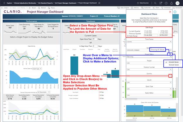
Figure 55: Click Dashboard Button and the
Project Manager Dashboard Displays
Refer to Navigation and Features and Common Dashboard Features and Options as needed.
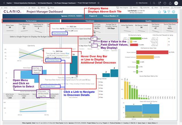
Figure 56: Use Options to Manage Dashboard Displays
· This Dashboard aggregates data and information into visualizations that display in tiles by Category (Performance, Timeliness, Quality).
· Populate “Days” fields with a numeric value; Days = U.S. Business Days. A default value may display.
· Some aspects (e.g., graph elements) of the visualizations act as filters for selecting specific metrics and updating the visualizations to represent the data for the selections.
· Multiple options are available that allow you to View, Filter, Download, and Drill Down to additional details about the category metrics that display on this screen.
· Hover over selected tiles to display onscreen information.
·
Use the ![]() (open filter) button at the
top of the screen to set and select the metrics that display on your dashboard
screen.
(open filter) button at the
top of the screen to set and select the metrics that display on your dashboard
screen.
· Click on a Bar or Line (in chart) to filter by selected metrics. Hold the Ctrl key (keyboard) to select multiple filters. All tiles and charts update to represent data for your selection. The selected data displays in full color and other data displays “lowlighted” on the screen.
· Links display for selected metrics when you hover to display additional onscreen detail.
·
Use the ![]() (clear filter) button to
remove all filters and reset the onscreen display of data.
(clear filter) button to
remove all filters and reset the onscreen display of data.
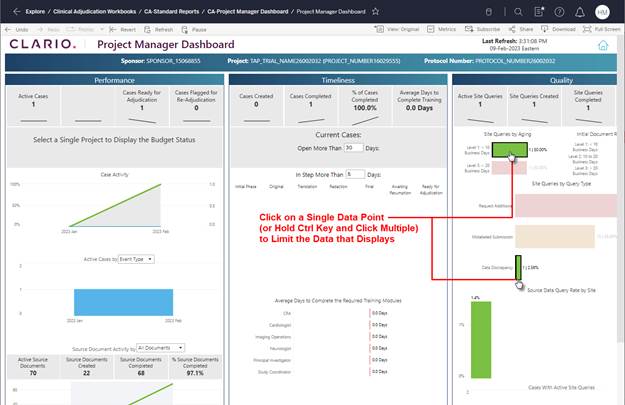
Figure 57: Click or Ctrl Click to Select and Filter Data Onscreen