Use the Dashboard filter (when applicable) to change the display of the graphs that represent the KPI data, based on the time category selection (Years, Quarters, Months, Weeks, Days).
Using the KPI Date Granularity option changes the display only and does not change the data applied to the visualizations.
1. Click the ![]() (open filter) button at the
top of the screen.
(open filter) button at the
top of the screen.
2. Open the “Time Unit” menu.
3. Click on an option.
4. The KPI graphs update to reflect the selection.
5. Click the ![]() (close) button, at the top of
the screen to exit the filter selection view.
(close) button, at the top of
the screen to exit the filter selection view.
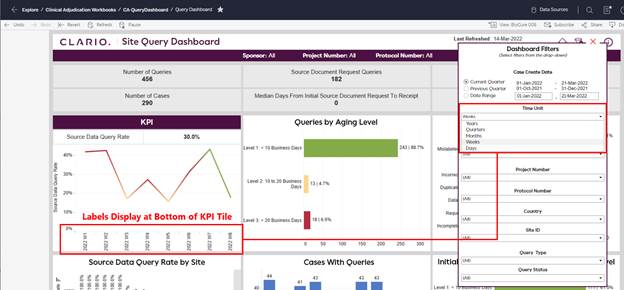
Figure 52: KPI Display Options in Dashboard Filter Menu
Related Topics